The Gooru recently posted “4 Tips for Making Professional Looking Google Documents.” Here are a few more tips for using Google Docs for professional looking documents.
1) Use Invisible Tables
Using the “Table” menu insert a table to organize the content on the page. Right click on the table to choose “Table properties…”
Choose a table border of zero to erase the table lines. This applies to the entire table.
Cell background color only applies to the cells in the table that are highlighted. Create colorful bars by changing the cell background color in table properties.
2) Choose Fonts
It is recommended to not use more than 3 fonts in a document. Check out Google Fonts:Â http://www.google.com/fonts. Google has literally hundreds of fonts for you to choose from. All of these fonts are available in Google Docs.
From the Google Fonts website you can find fonts that pair well together. The icon next to the “Add to Collection” button is “Pop out.”
This will bring up a window with additional information about the font. Go to the “Pairings” tab to see which fonts might pair well with your chosen font.
In the Google Doc, choose “More fonts” at the bottom of the font list to search add additional Google fonts to your font choices.
3) Format Painter
When you paste from one source to another the formatting can become a little wonky. One tip is to hold down the shift key when you paste in order to match the destination formatting. (Control Shift V). If you have already pasted text or you simply want to change the formatting you have in one section of your document to match the formatting in a different section use the format painter.
Highlight the text that has formatting you want to reproduce. Click on the “Paint format” icon in the toolbar. This copies the formatting style to the clipboard. The next thing that you highlight will reformat to match.
4) Consistent Headers
Oftentimes we create header styles manually each time by bolding the text and increasing the font size. Google Docs allows you to set the header styles. Each time you designate text to be a certain header the formatting will automatically be applied. As an added bonus if you decide to change a level 1 header to a smaller font size or different color then all of the instances of level 1 headers will be updated. Using headers also makes your document more accessible to screen readers.
To change the default headers create a header style by applying the font, size, color, etc… to a selection of text. While the text is highlighted click on the drop down arrow next to where it says “Normal text” in the toolbar. Hover over the header style to reveal an arrow. Choose “Update ‘Heading ‘ to match.” Â Highlighting text and going back to the heading drop down menu to select a heading style ensure that all of your headings are consistent throughout the document.
5) Insert Graphics
Looking at a huge block of text is mind numbing. Break up the text by inserting graphics. Use the Insert menu to insert an image. If you already have a graphic you can simply drag the image onto the Google Doc. Another option is to “Search” for images to insert. Notice the last option in the “Insert image” pop up is “Search.” Once you do your initial search you can filter the search by color or even by type of image.
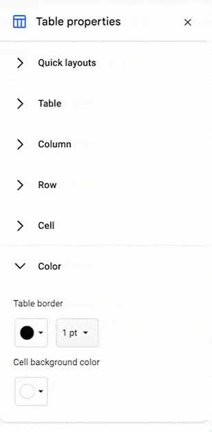
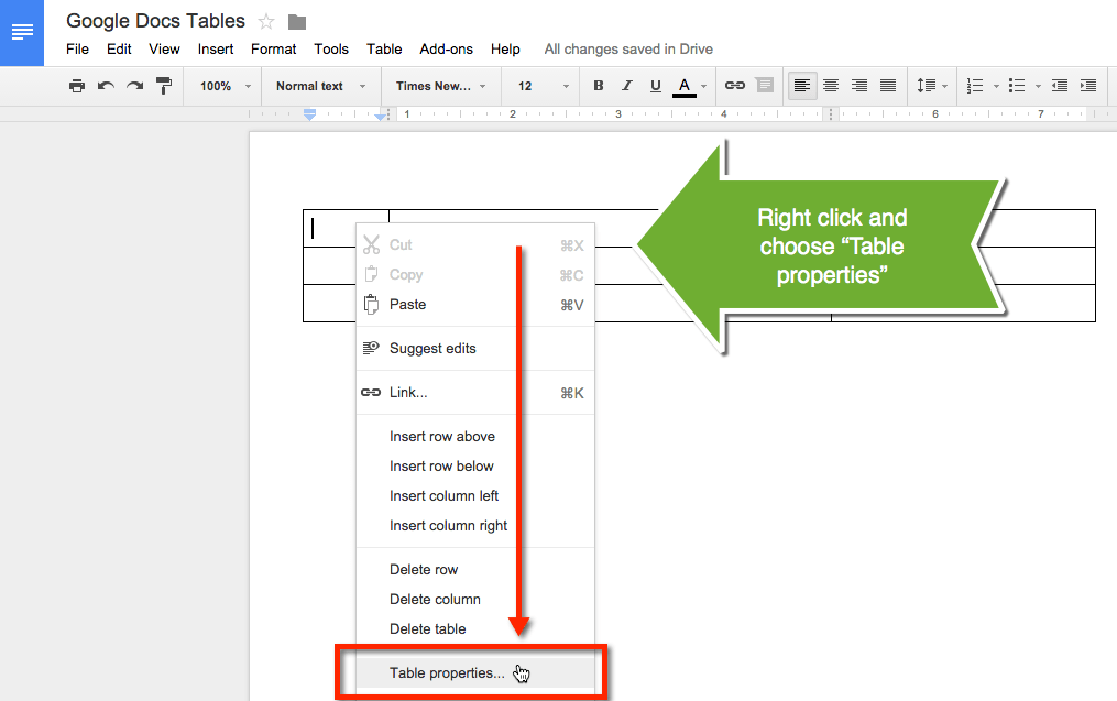
A tip for inserting graphics is to use the invisible tables method. Create a 2×1 table or a 2×2 table. Insert the image into one of the cells. Highlight the cells of the table. Right click on the table and choose table properties. Change the table border width to zero. Align the text to be centered vertically in the cell. This will have your text side by side with your graphic in a very attractive format.
To view my sample document to create some of the effects for the screenshots in this post go to:Â http://goo.gl/8Md4ji
LoveLoveLoveLoveLoveLove these tips, Alice. Felt quite proud of myself that I actually did #1 just yesterday (as cheat to create appearance of columns). The others are all new and I”m excited to play. Thanks!
Tables aren’t ideal for people using accessibility software like JAWS. Most users don’t know how to properly format tables so that screen readers speak them properly. The display might be nice for a sighted person, which I suppose is the purpose of the recommendation, but for accessibility reasons, it’s best to avoid them if possible.
I love that you mentioned the use of proper headings (as opposed to just changing the text size and making it bold) to improve accessibility to screen readers. However, your first recommendation (invisible tables) goes against accessibility best practices which call for using tables for tabular data rather than for styling or layout purposes. Maybe there is a way to accomplish the same idea using styles.
Thank you Alice for all of your help!!
Alice you add so much value to the community. Great post … I’m sharing this with my students next week.
Loved the tip about making invisible tables. I’ve struggled in the past trying to create that look and now I will use what I learned today!
Thanks,
Natasha