Each class I ask my students to fill out a Google Form to check into class. I also ask the students to provide a link to their digital portfolio where they post all of their work and I ask them for “Comments/Questions/Concerns/Compliments” so I can respond to them personally. Recently I have added a rating scale of their comfort level in the class. This has really helped me to better target the students 
Pivot Table
After the students have signed in I run a pivot table in order to see how the students comfort level is in the class.
Highlight the Columns
To run a pivot table first highlight the columns on the spreadsheet of responses from the Google Form. Note you can not use the awesome box on the corner to select all. You must highlight the columns manually.
Data Menu
After highlighting the columns of data use the Data menu to choose “Pivot table report.” 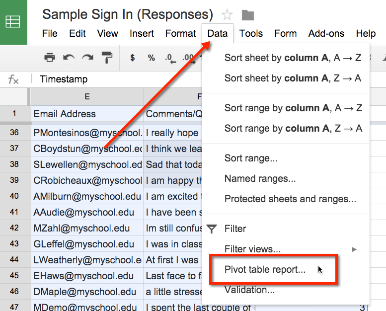
Columns
Selecting a pivot table report generates a new tab in your spreadsheet workbook. Initially the sheet is blank. Using the “Report Editor” on the right hand side, add a field to the Columns options.
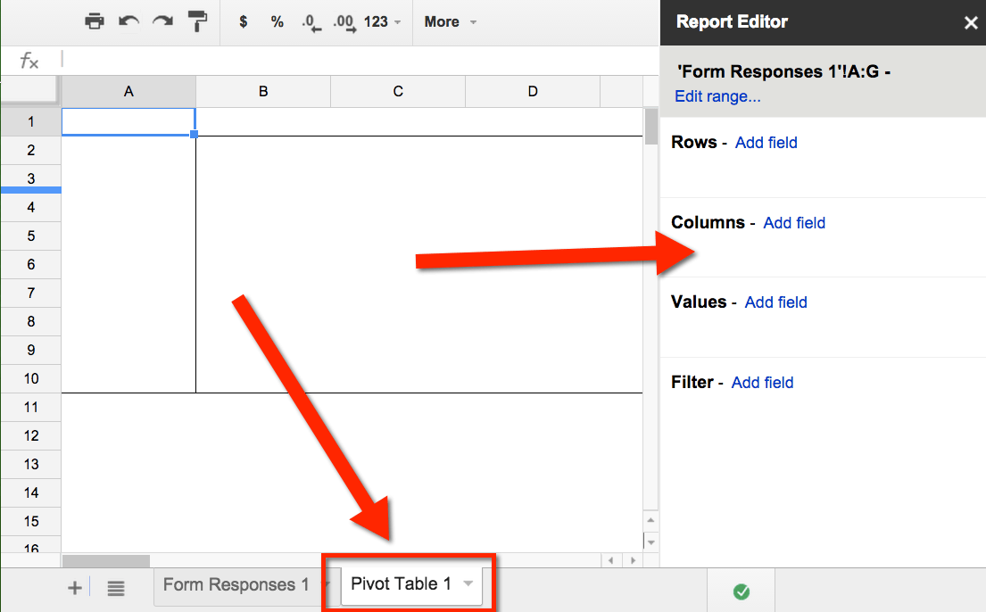
You want to summarize the comfort level data. Choose the question concerning the students comfort level in the class. 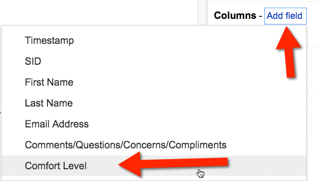
This displays all of the options students selected along the top of the pivot table. I resize the column widths to be skinnier to make it easier to see all of the data at once.
Count Values
For each comfort level I want to count up how many students selected this option. In the “Report Editor” add a field to “Values.” (Note that if you can not see the Report Editor, simply click on the pivot table cells to bring the editor back.) When counting it does not matter which field you count, but you do want to make sure there are values to count. In other words that a student did not skip the question. Since Timestamp is automatically generated for each student response I usually use the Timestamp value when I want to count responses. 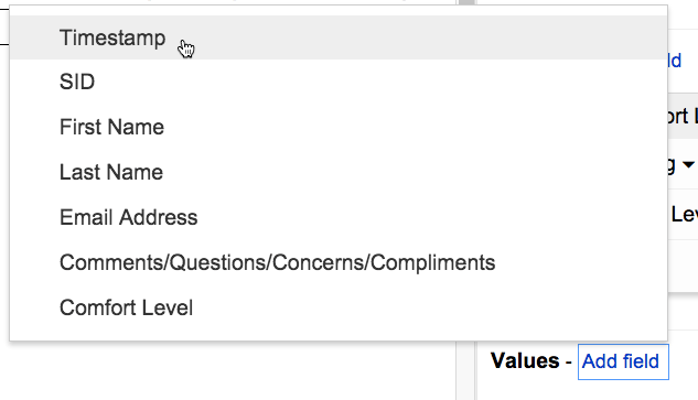
Count A
By default the pivot table will want to Sum, or add, the values. Click on the drop down box and choose to summarize by “CountA” instead of “Sum.” 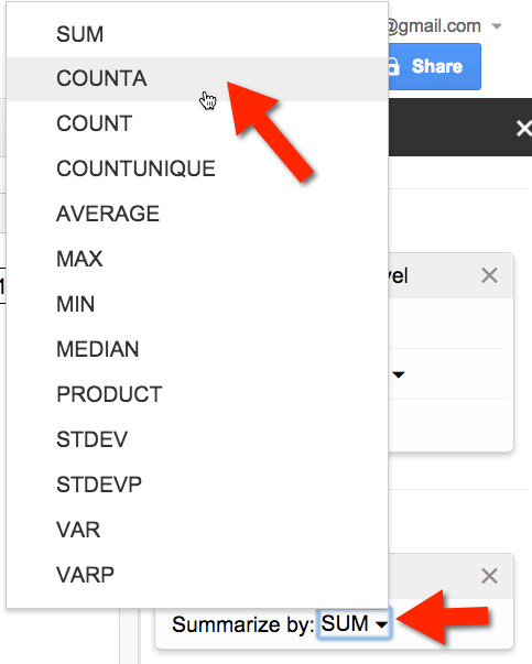
This will give you a count of how the students are feeling about the class. 
Targeting Students
After viewing the overall summary you may want to identify the students who are not feeling comfortable.
Filter
In the “Report Editor” click on “Add field” under “Filter.” Choose the question that addresses student comfort level. Click on the drop down option on the filter. Clear the checkboxes that are selecting all of the values and only select the the lower comfort level rankings.
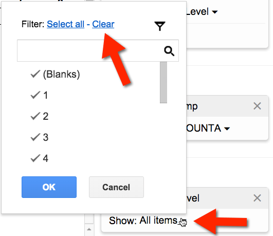
This will show you the summary data for only the values you checked.
Adding Students
To see who specifically was not feeling comfortable with the class you will want to add fields to the “Rows.” 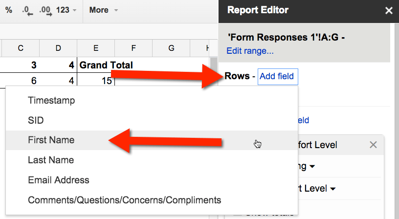
Add the field for the students name. Uncheck the “Show totals” checkbox.
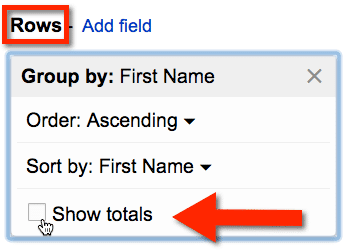
This will give you a list of the students who selected the lower comfort levels. You can add additional row data to give you more information about the student. Go back to “Add field” for “Rows” and add the students last name. Uncheck the “Show totals” checkbox. Again add another field for student email address. Also uncheck the “Show totals” checkbox. This will allow you to easily contact the students who are in need of help. Add one more field for the “Comments/Questions/Concerns/Compliments” in order to view the comment the student submitted for that class. Unchecking the “Show totals” checkbox will cause the multiple rows for the fields to line up into in a single row.
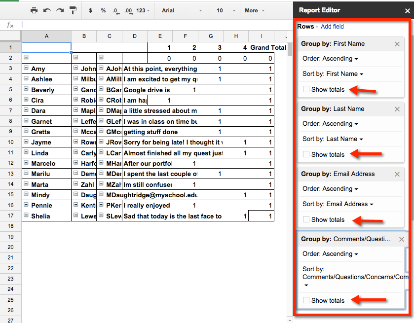
I now have a list of student names, email addresses and the comments they shared with me in a single list.






1 thought on “Google Forms: Daily Sign In – Identifying Struggling Students”