A pivot table is an essential tool for teachers. Pivot tables SUMMARIZE. Given that we have 30-150 students each doing multiple things we have lots of need for pivot tables.
Join cue.org/microsoft May 27th at 7pm PST for my webinar on Pivot Tables in Excel Online
Questions You Can Answer with a Pivot Table
- How many students went to the bathroom?
- What is the average score on question 8?
- How many students answered question 12 correctly?
- Whose state test scores are above basic?
- How did students peer evaluate each other?
Sample Data
Link to this Excel spreadsheet with sample pivot table data. You will want to use the File menu to download the spreadsheet to your computer. Then go to excel.office.com and upload the downloaded spreadsheet. Google users go to alicekeeler.com/pivotdata and make a copy.
Information that Repeats
One of the key reasons to make a pivot table is for information that repeats. Notice in the spreadsheet below I have a list of team names and how many points they earned on a particular day.

Highlight the Data
Highlight the columns that contain the data you want to answer questions about.
Use the Insert Menu
In Excel Online you want to use the Insert menu to click on “Pivot table.” In Google Sheets use the DATA menu to select pivot table.
Checkbox Things
in the sidebar you will be asked what you want to summarize. In Excel Online click the checkboxes of what columns you want to select.

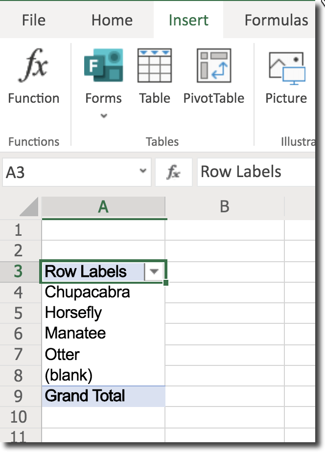
In my example I will first select “Team.” Notice in the spreadsheet each team in column B is listed multiple times. There are 177 rows of data. However, when I click the “Team” in the sidebar the pivot table only shows 5 unique fields in the 177 rows. Any repeats are not listed.

How many points did each team earn?
Checkbox Points
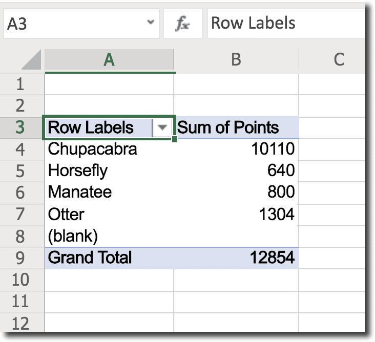
When I make a second selection of points a second column appears to show the SUM of Points. With no effort, I can tell how many total points each team earned.

In Google Sheets use the sidebar to first “Add” a row for what column you want to summarize. In this case “Team.” And then use “Values” to “Add” the “Points” column. This will create the same pivot table as Excel.

More Questions
The pivot table defaulted to SUM. It added up all the points. But there are a lot more questions you can ask about this data.
- “What is the average number of points earned?”
- “What is the largest amount earned in one day?”
- “How many days did this team compete?”
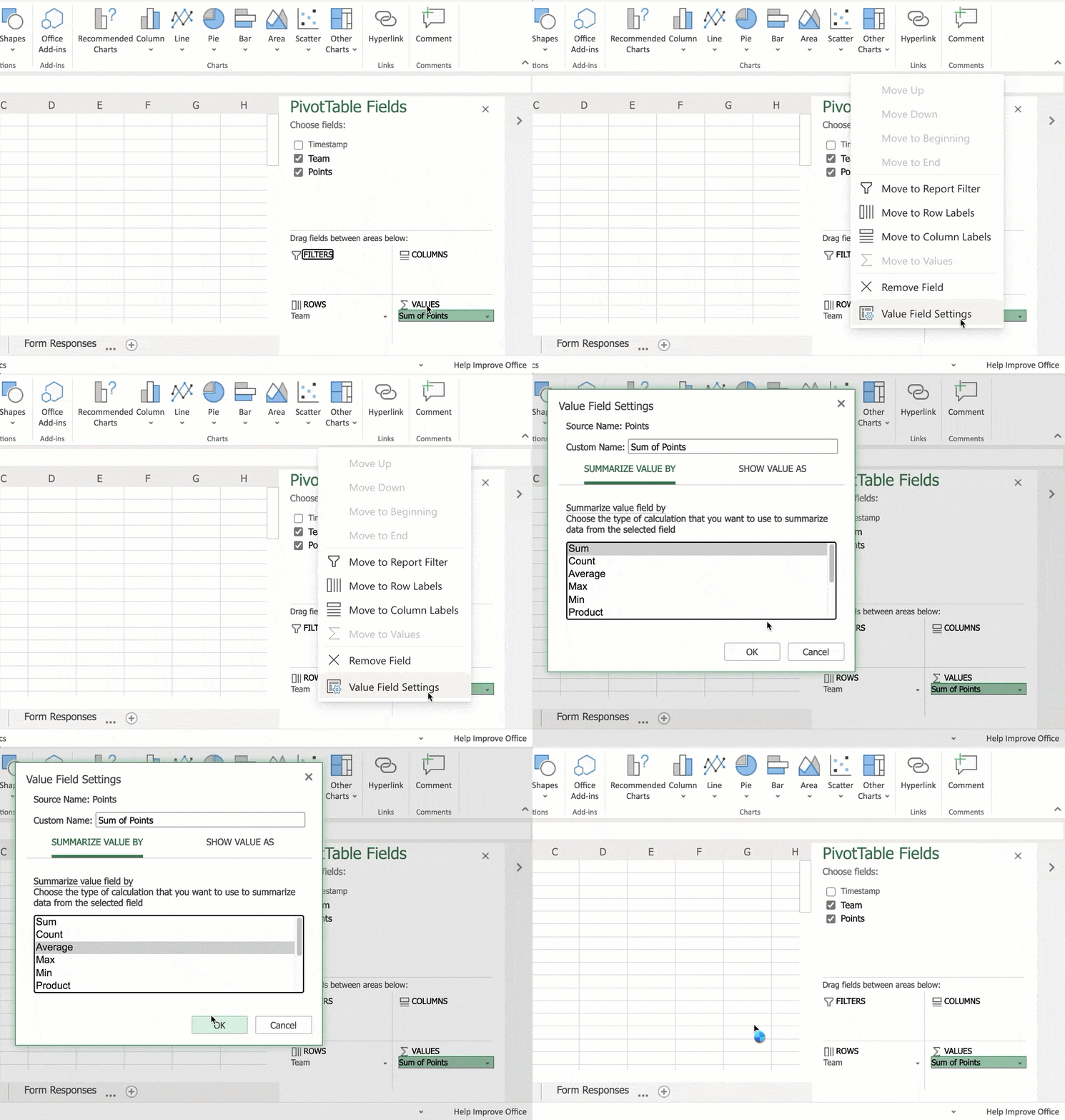
Notice on the bottom right of the pivot table sidebar under “Values” it says “Sum of Points.” Click on this and choose “Value Field Settings.” From there you can select how you want to summarize your data. Instead of “Sum” choose “Count” or “Max.”


