


Use Google Sheets to Guide Class Analysis
Every week the New York Times is providing a graph for teachers to use with their students. Using this free activity you can easily include ANALYZE into your lesson plans. The problem with a class discussion can be that not all students can participate in each prompt. “What do you think is going on here” would most likely not be accomplished by going around the room and hearing from each student. Using a spreadsheet or other digital tool can allow all students time to think, to include their observations, and to learn from the observations of everyone in the class. Below are directions on how to create the spreadsheet.
These observations are based on the October 3rd graph.
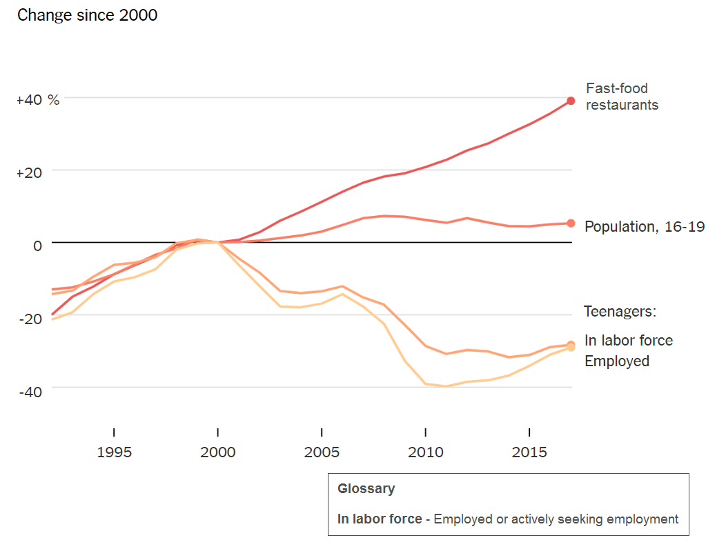
October 10, 2018 Graph
This week’s graph from the New York Times:
I have been doing these graphs with my students and I am loving the discussion. At first, it can start with blank stares and “I don’t knows.” By the end of the discussion, they are giving some insightful interpretations of the graph. I especially enjoyed last weeks graph. Turns out my students have never heard of a Supreme court justice. Nor did they know what a conservative or a liberal meant. Giving a quick definition, I then asked them “Now what do you see in the graph?” Their ability to interpret the graph after a quick definition of conservative impressed me.
Create a Google Spreadsheet
Either go to Google Drive and start a new spreadsheet or go to https://sheets.google.com/create
Select the Awesome Box
In the upper left hand corner of the grid is the awesome box. This is to the left of the column indicator A and above the row indicator 1. Clicking the awesome box selects all.

Widen Any Column
You can adjust the width of ANY column and all columns will adjust the same. Hover your mouse between any two column indicators. The mouse will change from the pointer arrow to a sideways dark arrow.
Widen Any Row
Similarly, widen any row to make all the rows taller. Hover your mouse between any 2 row indicators, the arrow should change style. Hold down and drag the height of the row. 
Set Word Wrap
I like to say “Middle, Middle, Middle.” In the toolbar locate the centering icon. You want to center the text of all the cells horizontally and vertically. Then you want to set word wrap on the entire sheet.
Name the Tab
Double click on the tab at the bottom to name it “Notice.”
Duplicate the Tab
Now your spreadsheet is all set up, don’t recreate the wheel. You will want a copy of the sheet for each question prompt. Click on the tiny triangle on the tab and choose “Duplicate.”

Rename the Tab
Double click on the new tab to rename it to “Wonder.”
Duplicate Again
Click on the tiny triangle on the tab to duplicate the tab to make a 3rd tab. Double click on that tab to rename it to “Headline.” The prompt in the NY Times asks the students to create a headline based on their inferences from the graph.
Share
After creating your spreadsheet, share it with students so they have edit access. You can do this through Google Classroom or by modifying the sharing permissions and linking the students to the spreadsheet.
Display
Display the graph. Verbally, ask the prompt “What do you notice is going on in the graph?” Instead of students raising their hand and shouting out, have them put their response in the spreadsheet. Display the spreadsheet showing the students all inputting their answers. Engage the class in verbal discussion about the responses. “What else can we observe about that?” “What do you think that means?”
Ask students to move onto the next tab in the spreadsheet and indicate things they wonder about the graph. Have the students discuss and respond to the ponderings.
Finally, ask the students to go onto the 3rd tab and write a headline that they think would go along with the graph. Discuss the headlines together.
Template
If you would like to use my spreadsheet I already made here is the template.
A Game-Changing Approach to a Back to School Syllabus by @MeehanEDU