Have Students Analyze A Graph
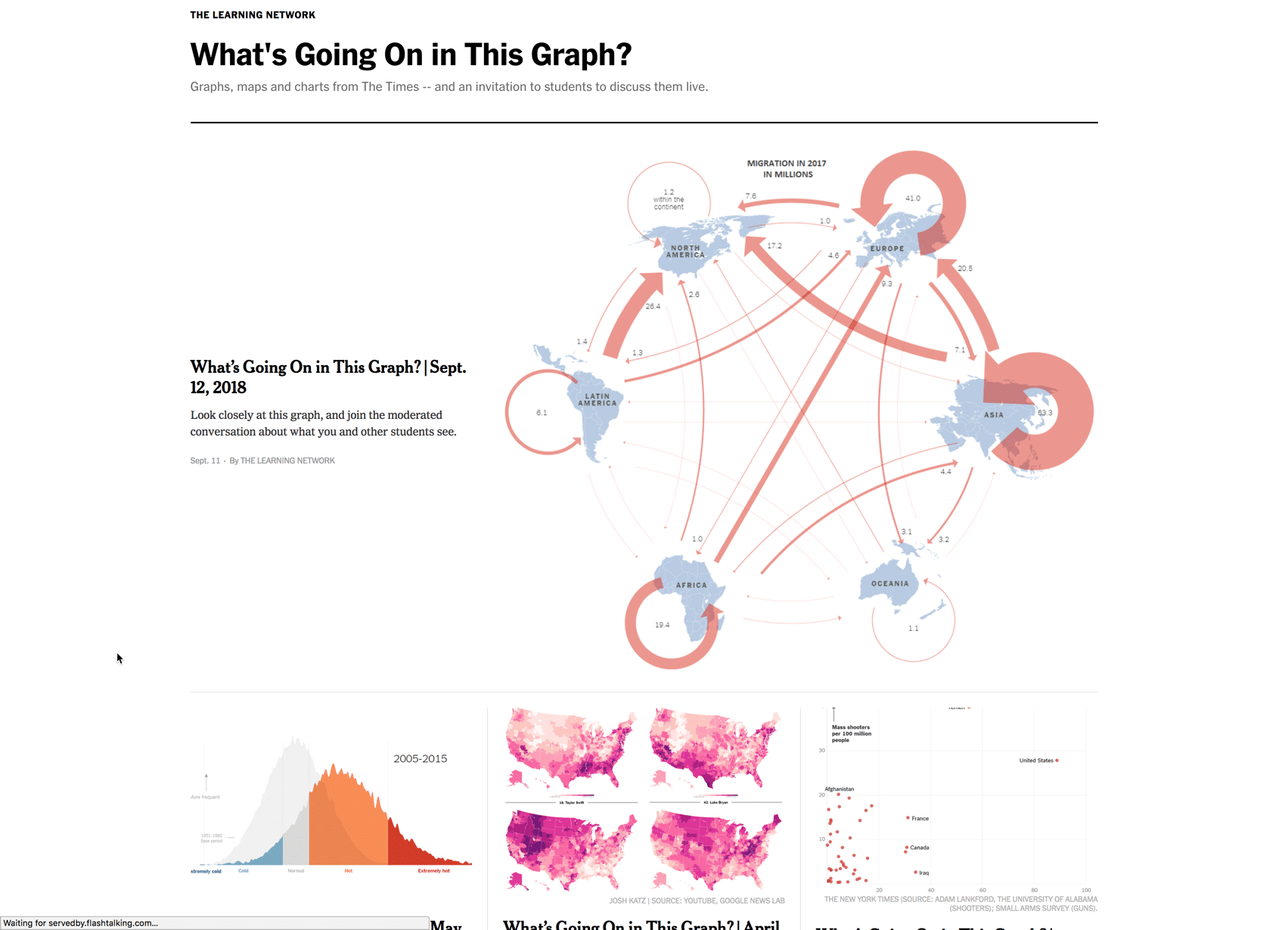
The New York Times is putting out an amazing resource for teachers. Every week they are posting a graphic and asking students to determine what information the graph is providing. What an excellent way to have students use real data, to analyze over memorize, and engage in class discussion.
Google Slides
I love collaborative Google Slides. All students in the same one Google Slides. For the September 12, 2018 graph I have put this into Google Slides. Share a copy of the Slides with the students with edit access. Next to the plus icon in the toolbar is a tiny triangle to add a slide layout. Students will choose the blue layout to share their thoughts on the graph. Click the “Present” button to easily share student ideas and to spark discussion around student observations. By starting in Google Slides you give each student time to think. Rather than the first student to raise their hand getting to share their thoughts, everyone gets to participate. Google Slides are multi-media so the students can also add graphics and video to help emphasize their thinking.
Google Sheets
I, of course, am a big fan of spreadsheets. “The answer is always a spreadsheet” I like to say. So I made a spreadsheet to allow students to post their thoughts onto essentially a digital bulletin board. Share the spreadsheet with edit access to your students. Each student claims a square (cell) to share their ideas. Again, using a digital tool allows you to hear from every student. Use the collective ideas displayed to fuel classroom discussion.


1 thought on “What Is Going On In This Graph from the NY Times”
This is a neat idea! ?