After collecting data from a Google Form it is likely that you want some summary data. Pivot tables allow you to not only count or add up information in your spreadsheet but also enables you to cross tabulate with another characteristic. For example to count how many votes each candidate earned but break down the votes by gender.
Summary of Responses
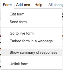
The summary of responses can be found under the “Forms” menu in the spreadsheet.
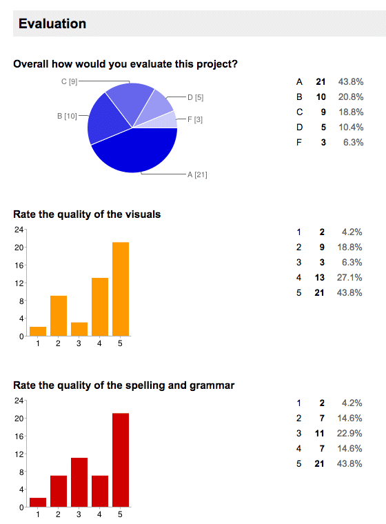
This automatically creates charts and summary information for the questions you asked in your Google Form. Click Here for a sample of a summary of responses. This data is from sample peer evaluation data. It is nice to know how many A’s, B’s, C’s, D’s and F’s the students evaluated but this does not break it down per student.
Pivot Tables
Pivot tables allow you to define how the data is summarized. Pivot tables in Google Sheets also update automatically as more Google Forms data is submitted.
Click Here to make a copy of the sample spreadsheet data.
Highlight Data Columns
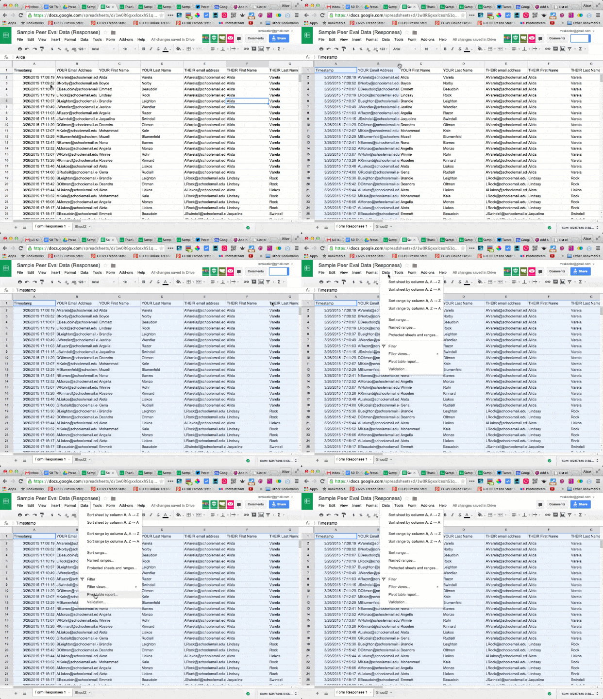
The first step is to highlight the columns of data in the spreadsheet that you wish to summarize. You can highlight columns that you are not intending on summarizing. Do not click the square in the corner that highlights all of the data. Google Sheets requires that you explicitly define your data range.
Data Menu
While your columns are highlighted go to the Data menu and choose “Pivot table report…” This will create a new tab for the pivot table.
Report Editor
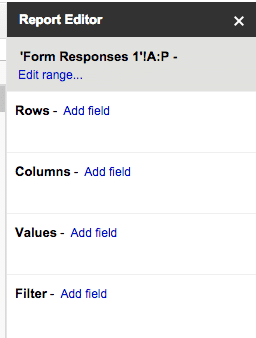
On the right hand side of the spreadsheet is the “Report Editor.” This allows you to determine which data you want to summarize in the rows and columns of the pivot table.
Add Field
Determine what information you want to summarize. In the case of the sample data I want to summarize by student name. Pivot tables work when you have the same piece of data repeated. The pivot table will only list each occurrence one time.
Row – Add Field
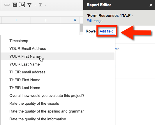
Click on “Add field” next to the row and determine which column of data you want to summarize.
Values – Add Field
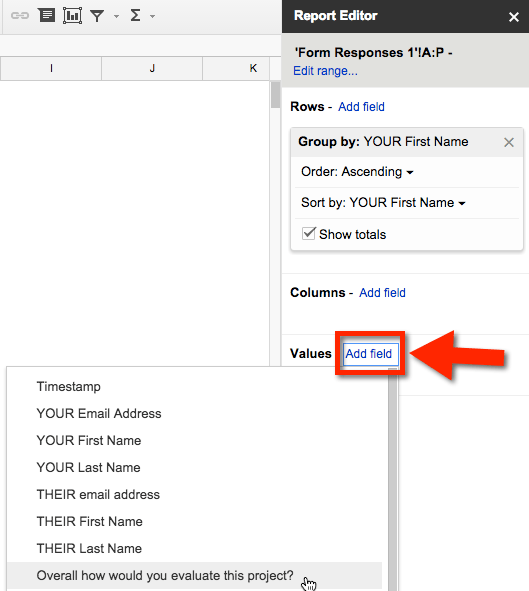
On the right hand side of the “Report Editor” is where you determine which values you want to count or add. By default the pivot table will attempt to “Sum” (add) your data. For the sample data I want to count up how many A’s, B’s C’s… each student assigned to other students. I select the column of “Overall how would you evaluate this project?” for the values.
Sum to CountA
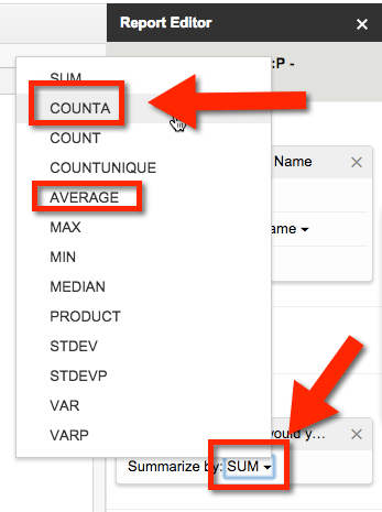
By default the values are summed together. By clicking on “Summarize by: SUM” you can change the summing of the values to counting the values by choosing “COUNTA.” CountA counts non numerical values. Another popular option is to average the values.
Example
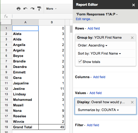
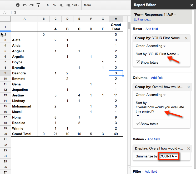
Using the sample data you can see that the pivot table is counting how many evaluations each student submitted. Aleta completed 3 peer evaluations, Alida only completed 1 peer evaluation and Jestine completed 11 peer evaluations.
Column – Add Field
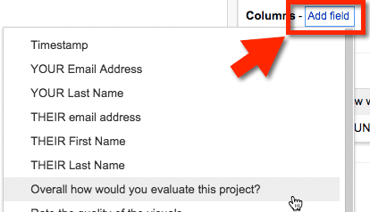
You can add another dimension to your pivot table by adding a characteristic to summarize to the columns. It is suggested that you choose columns of data that have repeating values. Each unique value will only be expressed once. On the right hand side in the “Report Editor” click on “Add field” to select the values you want to summarize. For the sample data I chose “Overall how would you evaluate this project?” to place the values of A, B, C, D or F along the top of the pivot table.
Example
Notice in the sample pivot table that it now counts how many of each type of grade the student evaluated at. The center of the pivot table allows you to get a count for each student for each grade they evaluated at. The right side of the pivot table gives an overall total of evaluations for each student. The bottom of the pivot table provides an overall count of how many of each letter grade was evaluated. As you can see from the pivot table that an evaluation of “A” was most popular.
Other Pivot Tables
The above sample table was able to provide a count of how many evaluations each student completed. This helps the teacher to see if students followed directions as to the number of evaluations. By adding the possible grades to the columns the teacher can see if students were taking the peer evaluation process seriously. In the case of “Nona” she evaluated 8 projects at a level of “A” and one project at a level of “C.” While possible, it is improbable that Nona had only found excellent projects. This alerts the teacher to look further at Nona’s submissions and see if she indeed was a critical evaluator or was just giving everyone an A.
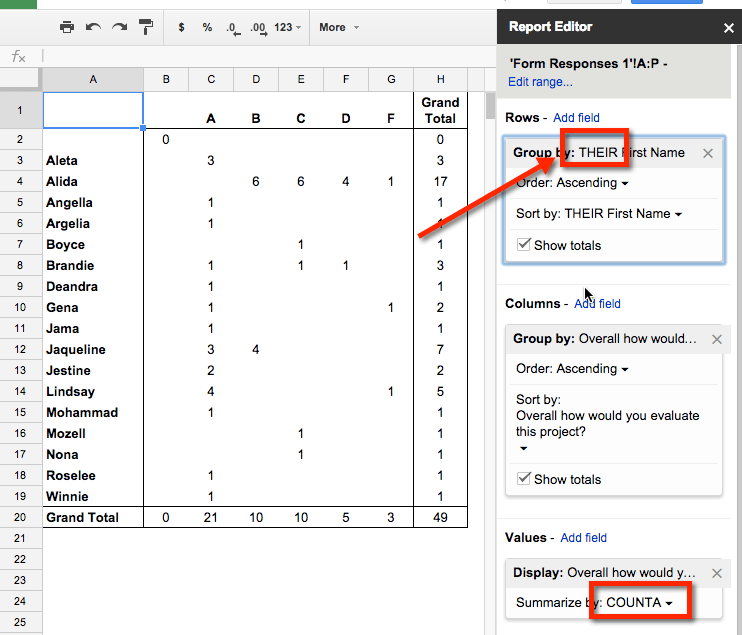
Another interesting pivot table is to look at the data from the perspective of the student being evaluated. Switching the rows from the evaluators name to “THEIR” name of the student who was evaluated shows how many A’s, B’s, C’s, D’s and F’s student peers evaluated. It would be expected that scores would be clumped together. In the case of “Jaqueline” 3 of her peers evaluated her project at the “A” level and 4 evaluated it at the “B” level. This is what would be expected if peers are taking peer evaluation seriously. In the case of “Alida,” 6 students evaluated her project as a “B”, 6 as a “C”, 4 as a “D” and 1 as an “F.” This is quite spread out and calls into question as to why peers evaluated Alida all over the place. A closer look at Alida’s project along with who evaluated Alida can shed more light on these findings.
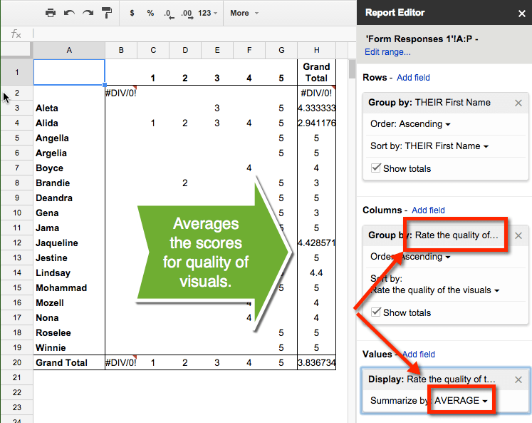
Another pivot table can look at the average of the scores. One question on the sample data was to “Rate the quality of the visuals” for the project on a scale of 1 to 5. Changing the columns to group by “Rate the quality of the visuals” and changing the values also to “Rate the quality of the visuals” and “Average” the scores is a quick way to obtain the average project evaluation for visuals.
There are many other pivot tables that can be created from the sample data. You can edit the single pivot table or can go back to the data (highlight the columns) and create a new pivot table.




2 thoughts on “Pivot This: Summarize Google Forms Data”
Do you know how many students I can put in a Google Form? For Student Name I want to be able to select the students for a multiple choice question. Is there a limit or max? I need to put in 100 – 500 names.
Thanks so much for including not just the tutorial, but a big ol’ chunk of data that I can import and play around with.