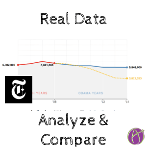
Real Data, Predict, Analyze, Compare, Discuss
This is just mathematically interesting (no political motivation here) https://t.co/iBd9Siiqjh
— Caitlyn Gironda (@Caitlyn_Gironda) January 15, 2017
You Draw It: What Got Better or Worse During Obama’s Presidency
I saw a tweet on Twitter linking to a New York Times article about the Obama presidency. I thought the way the article included interactivity was particularly clever and how much better it was than just reading static numbers.
Teaching Lessons
So what can we learn from this? We can straight up use this article with our students and design a lesson to incorporate it or we think about how to provide similar experiences for students.
- Interactivity: Have students interacting and not just consuming.
- Uses real data/news: This is not Joe carrying 50 watermelons. It is current, real data and a real news article. [tweet]Instead of a worksheet of made up number or sentences, try to get the information from someplace real.[tweet]
- Predict: Before the reader is given information the reader is asked to make a prediction. This draws them into wanting to know the answer. Even a blind guess, this increases interest. In general, start with students thinking before presenting them with what to know.
- Analyze/Discuss: Rather than just reading a chart students can analyze the results and compare with their guess. If students are working in small groups they can discuss with each other and see how their responses were different.
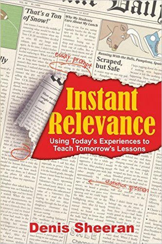
Instant Relevance
Want more ideas on how to use real data to engage students? Check out Denis Sheeran’s book “Instant Relevance.” It’s a super funny and engaging read and will help you to use current experiences to design lessons.











1 thought on “Real Data, Predict, Analyze, Compare, Discuss”
This article is incredible. What technology did they use to create it? I would love to use something like this in my lesson plans.