


Improve Your Students Reading With Lexend Fonts
Guest Post by Bonnie Shaver-Troup
If you are reading this, you probably already know that for more than 60 years the U.S. Dept of Ed has found that nearly 70% of the population experiences some reading difficulty. What you might not know is that Lexend fonts were created almost 20 years ago to change these stats.
Talking Font
While we generally consider reading a cognitive experience, reading is first a visual-perceptual experience. So, to be a successful reader we must first recognize and comprehend the orthography (the font)- and it must be done in milliseconds. Milliseconds for perceiving those little tiny letters and words. Font matters! Font is the messenger- it activates the reading voice in our head. When font is wrong, the voice is wrong, or worse, the voice is silent. When font is fit for us- it talks, confident and comfortable. So, to give font it’s voice- to make it chat- Lexend loosened up the spacing, created more white space, and reduced the noise and crowding. And since the early 2000s, in both clinical and school studies, Lexend fonts have been shown to improve reading performance among even our top performing students.
Help Students Find Their Font
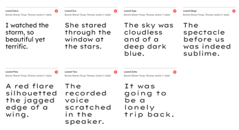
Educators can let students independently choose a style or they can recommend a style. If educators are going a step further and doing one-minute oral fluency testing for best fit, it is recommended to choose three consecutive styles and a consistent size- an example would be Peta, Tera and Zetta formatted at size 18. Oral fluency testing is not necessary; however, testing is more likely to ensure that the student is using the best style and size for their optimum performance.
Lexend Fonts
Beginning and severely struggling readers tend to benefit from the styles with looser character spacing, such as Peta, Tera and Zetta. Those who do not seem to struggle, but are looking for a more comfortable reading experience, tend to benefit from the styles with tighter spacing, such as Deca.
Lexend fonts can be used alone or paired with a text-to-speech assistive. Pairing can be particularly beneficial for beginning, struggling and visually impaired readers. The reading voice grows as students both hear the words and successfully perceive the words. Competence and confidence are partners for every successful reader!
The 7 Lexend fonts are available in Google Docs, Sheets and Slides (Click More Fonts)
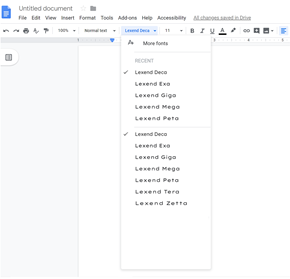
And in Google Fonts for general use, including web and Word docs.
For more information about Lexend visit
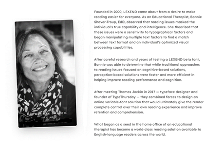
About Bonnie
Bring Bonnie to your school for professional development and training in using Lexend fonts for beginning and struggling readers, including dyslexia. Contact her at bshavertroup@lexend.com and follow her on twitter @bshavertroupEdD